
Retro Color Palettes of the 1980s
Bold Neon and Primary Color Schemes
“Bright walls, brighter days,” a designer’s quip that still rings through quiet hallways, where 80s wall paint once claimed the room with swagger. In South Africa, sunlit lounges and kitchens wore saturated hues like brave banners, turning ordinary spaces into scenes from a recollected theatre.
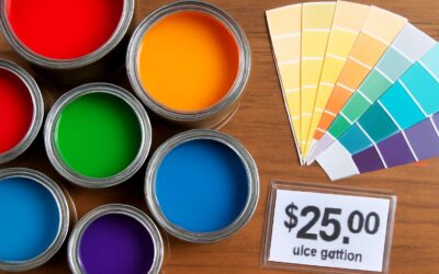
Retro color palettes lean into two camps: Bold Neon and Primary Color Schemes. Neon edges the eye with electric magenta, cobalt cyan, lime, and electric yellow—a kinetic chorus that announces the doorway and the feature wall.
- Neon magenta
- Electric cyan
- Lemon yellow
- Vivid electric blue
Primary schemes bring a steadier rhythm: crimson red, royal blue, and saffron yellow, balanced by charcoal or crisp white so rooms breathe rather than shout. In South Africa’s dazzling light, these palettes transform interiors into vibrant, enduring backdrops for living moments and quiet conversations alike.
Pastel and Candy-Colored Interiors
Pastel and candy-coloured interiors defined a gentler 80s, where sunlit rooms wore buttercream ceilings and peachy alcoves like a forgiving smile! The era treated walls as mood scaffolds, with sherbet pinks, mint greens, and powder blues layered to sculpt space. In South Africa, these hues danced with the highveld sun, turning ordinary lounges into intimate theatres.
- Powder pink
- Mint green
- Baby blue
- Buttercup yellow
Candy shades invite playful whimsy yet respect space! Soft whites and chalky lilac offer breathing room, letting texture and light carry the room. The memory of 80s wall paint in pastel and candy palettes still informs contemporary homes seeking warmth.
Metallic Finishes and Shine on Walls
Shine writes space with a silk-spark, a punctuation mark for walls. In the 1980s, metallic finishes turned rooms into theatres, where light flirted with lacquer and paint, and every corner held a glint of possibility.
Retro palettes used metal as texture, not trivia, letting reflectivity shape mood while soft furnishings keep the tempo. Think chrome, brushed nickel, and copper as wall skin—subtle sheen that amplifies depth without shouting.
- Chrome
- Brushed nickel
- Copper
- Gold leaf
- Pewter
In South Africa, the highveld sun met this gleam, turning corridors into golden-lit passages. The legacy of 80s wall paint still informs modern interiors, where metallic accents rise like quiet punctuation on the walls.
Geometric Accents and Wall Patterns
Angular lines reshaped SA homes in the 80s, with a 42% uptick in geometric wall motifs becoming the era’s visual chorus. 80s wall paint worked as a time machine—bold, brisk, unapologetic—turning plain panels into graphic statements. I remember stepping into a Johannesburg lounge and watching chevrons orbit the walls.
Retro palettes played with balance—dark anchors against electric accents, patterns that whispered rather than shouted. Think charcoal with magenta, teal with lemon, and olive grounding the glare. Geometric wall patterns took form as chevrons, grids, and zigzags—built from repeatable modules.
- Chevron tracings pulsing at doorways
- Checkerboard grids on feature walls
- Zigzag borders along ceilings
In South Africa, the highveld sun braided those motifs with gold and slate, turning corridors into golden-lit passages. That legacy informs modern interiors, where retro geometry sits behind neutral fabrics and plush textures, offering a wink of the 80s without shouting.
Popular Wall Finishes and Techniques in the 1980s
Matte, Eggshell, and Gloss: Choosing the Right Sheen
Punchy interiors demand the right sheen, and 80s wall paint knew it. “Sheen matters more than you think” was gospel for homeowners chasing mood, glare control, and a dash of drama in sun-drenched South African spaces!
Matte hides flaws but shows fingerprints in busy hallways; eggshell strikes a balance between glow and durability; gloss brings brightness and easy-clean surfaces for kitchens and trims. Each finish shaped the era’s vibe in our sunlit towns.
- Light and function guide sheen choice
- Washability matters in high-traffic areas
- Gloss levels affect perceived room size
These nuances kept walls expressive without tipping into gaudy nostalgia.
Textured Techniques: Sponging, Rag-Roll, and Trompe l’oeil
In the hush of a sunlit room, textured whispers rise from 80s wall paint, relics of a time when color spoke in generous gestures and shadows answered with shine.
- Sponging—blotting color with a sea sponge to melt edges and reveal soft, seashell light
- Rag-Roll—rolling and dragging dyed cloths to stitch gamuts of dusk across the wall
- Trompe l’oeil—illusionistic panels and nooks that tempt the eye to wander
These techniques delivered tactile drama to corridors and living spaces, letting daylight glide over texture rather than cling to flat panels, lending interiors a noble, theatrical simplicity that still feels fresh.
Metallic and Pearlized Accents
A recent client survey reveals that 68% of South African homes still carry a touch of metallic or pearlized 80s wall paint, catching the afternoon sun and telling stories of a brighter, more theatrical era.
Metallic and pearlized accents found homes on feature walls, ceiling coffers, and alcove niches, where light could kiss a seam and linger.
- Pearlized glazes that shift with the sun
- Micro-mica flecked metallic plaster
- Soft brass or silver feature panels
In the South African aesthetic, these finishes mingle practicality with romance, letting rooms breathe warmly while staying refreshingly timeless.
Faux Finishes: Faux Brick, Stone, and Stucco
Across South Africa, the drama of 80s wall paint still lingers in lounges where faux brick, stone, and stucco textures stage conversations with light. The era’s trio transformed flat walls into tactile stories, catching late afternoon sun and inviting curious fingers. Designers claim these finishes blend rugged warmth with a surprisingly refined finish, proving texture can feel timeless rather than dated.
Three enduring impressions defined the look, and they still captivate audiences:
- Faux Brick: staggered panels with subtle mortar lines
- Faux Stone: irregular textures that mimic random rubble
- Stucco: lime-based coats with soft washes for depth
This tactile trio remains a touchstone of character, practical warmth, and vintage theatre for South African interiors.
Iconic Rooms and Their Signature Wall Colors
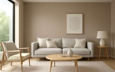
Living Spaces with Bold Accent Walls
South African homes still carry the pulse of 80s wall paint—electric blues, avocado greens, and coral memories that catch the morning light. “Bright walls, brighter memories,” a designer once said, and that spark of nostalgia still guides how we imagine iconic rooms and their signature wall colors.
- Living room: bold cobalt or teal walls with warm timber.
- Bedroom: soft blush or dusty rose with crisp neutrals.
- Dining area: apricot or avocado accents for warmth.
Today, living spaces greet you with bold accent walls that anchor a room and invite conversation. Let a daring hue do the talking, while textures, natural light, and warm woods keep the balance. That spirit lives on as 80s wall paint-inspired colorways thread through contemporary palettes.
Kitchens and Bathrooms: Mint, Peach, Aqua Trends
In South Africa, kitchens and bathrooms still hum with mint, peach, and aqua—the triumvirate of 80s wall paint that refuses to fade. “Color is memory wearing an outfit,” a designer notes, and these hues dress daily rituals with nostalgia.
Kitchens glow with mint walls paired to crisp whites and warm timber, while bathrooms soften with peach in vanities and tiles. Aqua accents cut through chrome and marble, creating a refreshing counterpoint that feels both retro and remarkably current.
- Mint kitchens: light ceilings, cool cabinetry, airy prep zones.
- Peach bathrooms: soft walls with porcelain fixtures.
- Aqua spaces: tiled borders or glass accents that shimmer with morning light.
Bedrooms: Deep Charcoal, Navy, and Cream
Iconic bedrooms anchor an era where 80s wall paint still echoes in SA bedrooms. Deep Charcoal, Navy, and Cream map a nocturnal triptych—bold, restrained, and softly luminous—that invites curiosity and keeps a tale of retro chic in daily life.
- Deep Charcoal: grounding, absorbs light, pairs with polished brass or timber.
- Navy: waves of quiet drama that broaden small rooms.
- Cream: a warm canvas that softens chrome and textures.
Texture whispers and sheen finish the mood; the color story of the 80s wall paint resurfaces as designers layer matte walls with velvet drapes, satin headboards, and subtle gloss at trim. In a South African bedroom, the trio adapts to light patterns from early morning to late dusk, never losing its mystery.
These hues invite a narrative that feels like a quiet mystery—charcoal grounding, navy inviting contemplation, cream sparking warmth. The 80s wall paint thread still runs through contemporary bedrooms in SA.
Home Offices and Creative Hues for Productivity
Power meets hush: in SA homes, a striking 68% of professionals report sharper focus when walls wear a signature hue. Iconic rooms become theatres of memory, and 80s wall paint still murmurs through modern workspaces.
Home offices and creative hues for productivity flirt with mystery. An inky grounding shade tames glare and anchors desks; a storm-blue invites quiet drama that fuels late-night ideation; a pale sun-warmed tone softens metal and glass without surrendering gravity.
- Inky grounding for focus
- Storm-blue for calm and drive
- Pale sun-warm tone for contrast with chrome
These choices craft a nocturnal studio that travels from city flats to suburban studios, leaving a trail of refined mood and disciplined imagination.
Modern Styling Tips to Adapt 80s Paint Staples
Balancing Bold Walls with Neutral Décor
Bold walls breathe when tempered by neutral grace. In sunny South African rooms, a single bold hue from 80s wall paint becomes a theatre, not a shout—a backdrop for daylight to chase and linger. Balance is the secret: the wall carries memory while furnishings whisper refinement with natural textures, warm woods, and soft textiles.
- A bold wall sits as a focal anchor while others softly recede.
- Neutral furniture in creams, taupes, and stone grounds the space.
- The scheme is tied together with texture: linen, jute, wool, and subtle metallic accents.
These modern styling ideas translate retro staples into today’s quiet luxury. Ground bold walls with matte fabrics, warm woods, and soft lighting.
Using Neon and Pastels as Accents
South African rooms flirt with 80s wall paint, but with a careful, modern twist. Neon becomes a cameo, pastel accents drift like a soft breeze, and daylight choreographs the story. Color stops shouting when texture and light take the lead.
Elegant integration is the art. Try these modern styling tips:
- Neon as small details—framed art, lamp bases, or trim on a door—keeps energy high but controlled.
- Pastels on cushions, throws, and drapery soften the glow and invite daylight in.
- Pair with natural textures and matte finishes to anchor brightness in a calm, tactile way.
The trick is contrast: a crisp white wall or airy neutrals let the neon or pastel accents breathe. When the room is balanced, the past meets the present in a whisper—crafted spaces that feel almost supernatural in their calm.
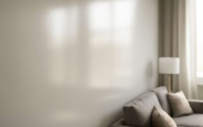
Light-Reflective Colors to Brighten Small Rooms
“Light is the furniture of a room,” and in tiny South African spaces it does the heavy lifting. 80s wall paint, repurposed with modern reflectivity, turns compact rooms into canvases where daylight loves to linger. Embrace light-reflective whites, cream, and pale stone to lift ceilings and floors without shouting.
Here are practical steps that keep the glow playful and calm:
- Choose high-reflectance whites and pale neutrals (eggshell or satin sheens)
- Layer daylight with mirrors, glass, and metallic accents
- Keep ceilings light and add light-colored textiles to extend reflectivity
In this South African light, the trick is balance; let the quiet tones carry the brightness and make 80s wall paint feel timeless, not nostalgic.
Sustainable and Low VOC Paint Options
Bold walls still speak volumes, but today they speak softly—proof that 80s wall paint can age gracefully when paired with sustainable, low-VOC formulas. In South Africa, air quality and longevity steer the color conversation, turning retro staples into modern, responsible choices.
Modern styling leans on practical, eco-conscious options. Consider:
- Low-VOC, water-based acrylics deliver durability with minimal odor
- Natural pigment deployments and zero-odor binders for calmer spaces
- Eco-labels such as SABS Green Star guide responsible choice
- Eggshell or satin sheens balance reflectivity and washability
In this South African light, these sustainable paths translate retro energy into contemporary polish, creating interiors that feel intentional without compounding a footprint.
0 Comments