
Factors Influencing Exterior Paint Color Selection
Climate and Sun Exposure Considerations
The South African sun is relentless. Its ultraviolet intensity fades pigments and fractures paint binders. This is why selecting exterior wall paint colors requires attention to local climate, not merely personal taste. Coastal regions expose walls to salt-laden wind, while the Highveld endures stronger UV radiation at altitude.
Climate dictates chemistry. Lighter shades reflect solar gain and keep interiors stable. Darker tones absorb heat, a critical factor for Durban’s humidity and Cape Town’s dry summer glare. I have watched identical shades perform differently on opposite sides of the same house.
- Track the orientation of each facade
- Note the timing of peak sun exposure
- Check local humidity and rainfall data
The angle of sunlight shifts throughout the year, changing how exterior wall paint colors appear. A hue that reads muted in winter can overwhelm in midsummer. Ignoring these variables invites premature fading and costly repairs.
Architectural Style and Its Historical Context
Cape Dutch homesteads demand limewashed whites, not the slate greys favoured by Johannesburg’s functionalist villas. Historical context acts as an unspoken social contract. Walk any established suburb and you will see that exterior wall paint colors reveal a neighbourhood’s ancestry. Victorian terraces in Cape Town’s Bo-Kaap refuse to wear the same hues as a Ndebele-influenced facade. The original palette came from available pigments and construction materials. Modern paint technology freed us, yet many homeowners still defer to antiquated preferences.
I have stood on pavements and overheard heated debates about a single shade of sage! These arguments expose our anxiety about historical identity. When selecting, consider these factors:
- Consult the heritage register for protected areas.
- Observe adjacent properties before finalising any decision.
The result is a conversation between past and present.
Working With Existing Permanent Elements
Standing on a Joburg sidewalk, I watched a homeowner repaint a boundary wall three times in one weekend, and I understood exactly why! The culprit was never the color itself. It was the raw brickwork and the burnt-orange roof tiles they refused to replace. Those permanent elements were the problem.
The fixed components of a facade remain while exterior wall paint colors do the bending. A roof profile, stone quoins around a Cape Georgian door, timber window frames, even the paving under a carport, they all stay unchanged. The paint must conform to them.
- Roof cladding shifts the undertone of any white.
- Unpainted brick forces paint to work as a contrast layer.
- Garden walls visually merge with the main facade.
The lesson came when a subtle grey turned lilac at sunset. The cause was rose quartz in the nearby stone wall. Permanent elements dictate how exterior wall paint colors behave in real light, no matter what the swatch promises indoors.
Impact on Curb Appeal and Resale Value
Prospective buyers form an opinion within eight seconds, often before leaving the car. In Johannesburg’s older suburbs, a facade in the right tone can lift an asking price, while a jarring hue shortens the viewing list. exterior wall paint colors communicate care, and buyers translate that into value.
I have watched buyers circle a block twice before parking, and the difference is immediate! The home with a considered palette, soft eucalyptus or warm sandstone, invites curiosity. The one with miscalculated contrast invites negotiation. This is not sentimental. Perceived maintenance costs and future effort rest on that coat.
- Earthy tones widen the buyer pool.
- Accent colors demand alignment with stone and paving.
- Consistency makes a modest home appear larger.
Selecting exterior wall paint colors with the street in mind, instead of only the interior mood, is an investment in the moment a buyer decides to linger.
Understanding Color Theory for Home Exteriors
The Color Wheel and Undertones Explained
Most exterior wall paint colors fail not because they are ugly, but because their undertones fight the surrounding landscape. The color wheel arranges hues from primary through tertiary, yet what matters most is what hides beneath the surface. Undertones are the subtle shifts in temperature inside a color. A beige can lean gray, pink, or green depending on its base pigments. Those shifts decide whether a facade feels crisp or muddy in South African sunlight. For example, a warm undertone pairs well with red earth; a cool one suits coastal mist. Consider these checks before choosing:
- Hold a sample against fixed stone or cladding.
- Check it at morning and late afternoon.
- Compare it with neighboring roofs and paths.
Reading the wheel in this way turns exterior wall paint colors into a precise tool rather than a gamble.
Light Reflectance Value (LRV) and Its Role
Light reflectance value, or LRV, measures how much light a surface bounces back. This number, scaled from zero to one hundred, tells you whether a facade soaks up heat or sends it away. In South Africa’s intense sunlight, a paint’s LRV can matter more than its hue.
Different exterior wall paint colors carry different LRVs, and that changes how they behave. I have seen standard shades perform poorly simply because their reflectance was wrong for the location. Here are three ways LRV influences a home’s performance:
– Low LRV tones absorb heat, which may suit inland winters but push cooling costs upward in summer.
– High LRV shades reflect harsh rays, which keeps interiors temperate but can appear stark against dark rooflines.
– Mid-range values balance heat and glare, though their look shifts with the time of day.
Perception of LRV also depends on texture and finish. Rough plaster softens light, while smooth surfaces sharpen reflection. A matte finish absorbs more than a gloss does, meaning two identical exterior wall paint colors can read quite differently. Understanding LRV prevents surprises when the sun moves across a facade.
Monochromatic vs. Complementary Schemes
Somewhere between the chaos of a colour wheel and a homeowner’s three-hour stare at paint swatches, sensible design principles can easily go missing. Monochromatic schemes are whispering the gentle art of restraint, using one exterior wall paint colour in varying tints and shades. This approach creates a cohesive, almost architectural effect on facades where shape and texture should carry the performance. A flat finish in deep charcoal, for example, provides drama while a lighter trim in the same family keeps eaves calm on a Johannesburg property.
Complementary schemes offer more visual tension, and they demand careful timing. Placing a warm ochre against a muted aubergine works best on facades with strong permanent elements, like a brick chimney or stone base, to anchor the contrast. When pairing these exterior wall paint colours, the application must be precise, or the effect turns from striking to peculiar. Consider this relationship:
– Consider the heat gain of each hue.
– Observe the colours at noon, not just at sunset.
– Test large patches on each wall orientation.
– Compare the pair against your roof tiles first.
A complementary pairing should never rely on sheer novelty to succeed. If you wouldn’t choose that purple for a family car, perhaps don’t put it on your gables. The most effective schemes still respect the building’s lines. If monochromatic feels subdued and complementary feels risky, a broken arrangement works well, using a secondary colour for doors only. Remember Koos, the neighbour who painted his house like a pepperomia? An honest test of confidence has never looked so loud from the street. Stick to the science of undertones, less to the impulse of personality, and your exterior wall paint colours shall speak with conviction, not a shout.
Strategic Accent Color Placement
The perception of exterior wall paint colors is never static; it is a conversation between the material and the passing sun. On a Highveld afternoon, the light has a particular clarity that flattens certain hues while giving others a strange, internal glow. You are not merely selecting a pigment, but a filter for how the structure willbe read by every person who passes it. I find that the most effective schemes treat the building as a single volume, then use accents to create a deliberate dissonance.
Strategic accent color placement is an exercise in controlling the viewer’s eye, not decorating every available surface. The front door, for instance, is a point of punctuation. It should command attention, but it should not require the rest of the facade to apologize for its presence. When you apply a high-contrast tone to the door, you create a visual anchor that draws visitors in, but the surrounding exterior wall paint colors must hold their own weight without competing.
To make this work, consider the specific elements of the South African suburban landscape:
1. The density of the surrounding foliage, which can either absorb or reflect light onto your chosen accent.
2. The materiality of your paving, as a strong terracotta or slate will influence the perceived temperature of the accent hue.
3. The shadows cast by your roofline, which act as a natural frame for the color you place beneath them.
There is a fine line between a confident accent and a visual contradiction. The decision to use a bold secondary hue should feel inevitable, as if the house demanded it from the first brick. If you find yourself hesitating, I would suggest looking at the trim around your windows first. A subtle variation in the depth of the main body color often provides all the interest you need, leaving the front door as a quiet confirmation of the overall intention rather than a source of potential regret. This approach keeps the narrative cohesive and the material integrity of the home intact.
Testing Paint Samples in Real Lighting Conditions
In a South African suburb, a north-facing wall receives over a thousand hours of direct sunlight in a single warm season. That makes exterior wall paint colors an environmental response, not a design formality. The colour wheel is useful, but it reaches its limit under this specific sky. The soil moisture, the sheen on a metal roof and the moving air between established trees all change a hue in ways that a paper chart cannot capture. I have found that testing paint samples in real lighting conditions matters more than any small read in a store.
- In intense noon light when the house is fully exposed
- At the low angle of early evening when the sun drops behind the roofline
- Right after a rainstorm that leaves the plaster cold and saturated
The differences between these moments reveal the actual identity of every pigment. That week of patient observation lets the final exterior wall paint colors become a dependable choice, not a hopeful guess.
Popular Exterior Paint Color Palettes and Trends
Classic Neutrals: Warm Greys and Taupes
Warm greys and taupes have quietly become the most reliable choice for modern South African homes. These shades do not shout, they settle. They carry a grounded quality that feels almost ancient, like the Karoo earth after a light rain. Homeowners are realising that these muted tones hold their nerve under the harsh Highveld sun, where bolder hues often bleach into chalky ghosts by the second summer.
What makes these particular exterior wall paint colors so effective is their chameleon-like nature. A warm grey shifts with the light, revealing subtle bronze or olive undertones as clouds pass. Taupe offers a similar quiet drama, sitting beautifully against raw stone cladding or dark timber garage doors. Both whisper rather than announce, which is precisely why they dominate upscale neighbourhoods from Sandton to the Garden Route.
Consider these pairings that have proven their staying power in local conditions:
– Greige with charcoal window frames and matte black rainwater goods
– Warm taupe with burnt orange front doors and cream facades
– Light mushroom grey with natural clay brick and off-white trims
These combinations work because they echo the geological layers visible throughout the country, from the Cape Fold Mountains to the Drakensberg escarpment. The result is a home that feels excavated from its site, not dropped onto it. When you choose these exterior wall paint colors, you are selecting a strategy that ages with grace, refusing to fall into the trap of fleeting fashion.
Bold Statement Hues: Deep Blue and Forest Green
Deep blue and forest green have moved beyond their status as accent shades. These exterior wall paint colors now anchor entire facades with a confidence that feels distinctly contemporary. South African homeowners are choosing these hues for their ability to hold depth in strong sunlight while retaining their richness in the evening.
The appeal lies in their connection to the landscape. Deep blue echoes the Atlantic at dusk along the Cape coast. Forest green mirrors the dense canopy of indigenous gardens in KwaZulu-Natal. These exterior wall paint colors create a deliberate contrast against the pale grasses and dusty roads of the Highveld.
Consider how these bold hues interact with other materials:
– Deep blue with pale limestone paving and silver-grey aluminium windows
– Forest green with raw timber cladding and bronze outdoor lighting
– Navy with white plaster walls and natural stone retaining features
These pairings work because the saturated base color holds the visual focus while lighter elements offer contrast. The result is a facade that feels intentional without being theatrical.
Earthy Tones: Terracotta and Ochre
Walk through any older Karoo town and you will see terracotta and ochre on walls that have stood for a century. These exterior wall paint colors draw from the red earth of the Lowveld and the sun-baked clay of the Karoo.
They feel grounded and familiar. The appeal is practical as well as visual. Terracotta carries warmth without shouting. Ochre sits quietly against blue skies and green gardens. Both shades develop a patina that suits farmhouses, townhouses, and modern builds alike.
Consider how these tones work alongside natural materials:
- Terracotta with untreated timber and rough stone
- Ochre with galvanised steel and grey concrete
- Clay shades with white window frames and dark roof lines
These exterior wall paint colors pair with other earthy elements, yet they also stand alone on a simple, unadorned wall. In my experience, homeowners trust them for a facade with character and a connection to the land.
Coastal and Cottage Whites
White walls dominate the Cape coastline for a reason. They deflect the harsh sun and stay cool when the south-easter blows. Coastal and cottage whites range from chalky limestone to soft greige, each with a different undertone.
Along the West Coast, homes wear pure white against the blue Atlantic. In the Cape Winelands, warmer whites suit thatched roofs and gables. The shade you choose changes how the wall behaves at dawn and dusk.
Consider these pairings:
- Bright white with dark timber or charcoal doors
- Off-white with natural stone cladding
- Cream white with black window frames
These exterior wall paint colors suit new builds and renovated cottages. I have seen them on century-old fisher cottages and modern beach houses alike. They hold their own against coastal light.
Modern Minimalist Black and Charcoal
Bold choices are rewriting the rulebook for South African homes, and black or charcoal exteriors are leading this charge. These exterior wall paint colors move past the safe and predictable, delivering a modern silhouette that commands attention without shouting. On the Highveld, where the light is crisp and sharp, a deep graphite acts as a foil to the sun, making architectural lines read with photographic clarity.
The appeal lies in a paradox: these dark shades absorb heat, yet they revolutionise how a facade interacts with its environment. They make white trim pop like a fresh shirt and turn timber elements into art.
– Pair charcoal plaster with raw steel or galvanised finishes for an industrial edge.
– Use matte black on weatherboard or fibre cement for a sleek, contemporary vibe.
– Combine a deep slate with warm wood cladding to soften the overall intensity.
What surprises most is the versatility. A home shrouded in a mysterious dark grey can feel both imposing and welcoming, especially when framed by the golden afternoon light of the Cape. It is a departure from the coastal whites, but it stands just as strong against the elements. For new builds looking to establish an instant identity, these shades are unlikely to fade into the background.
Choosing the Right Finish and Sheen
Flat vs. Satin vs. Gloss: Pros and Cons
The finish you choose for your exterior wall paint colors carries as much weight as the hue itself. It determines how the light interacts with the facade, how the surface handles dirt, and how quickly it fades under the African sun. Many homeowners pick a beautiful colour, only to see it fail because the sheen was wrong for the surface.
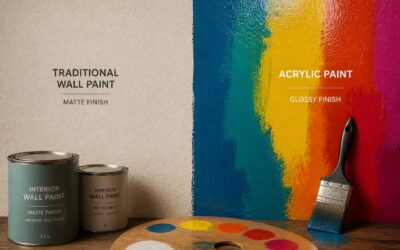
Flat finishes offer a matte appearance that absorbs light. They excel at hiding imperfections in older plaster or brickwork, making the wall look smoother than it truly is. The trade-off is durability. Flat paints are porous, meaning they will absorb moisture and grime more readily. In South Africa’s dusty Highveld or coastal mist, a flat finish can appear streaked and dull within a few seasons.
Satin strikes the balance between concealment and resilience. It has a soft, low-lustre glow that reflects some light without being shiny. This finish resists moisture better than flat, making it a common choice for homes near the ocean where salt air is a constant concern. Satin also washes cleanly, so you can remove dirt without stripping the paint. The slight sheen will highlight any undulation in the wall, but the forgiving nature of the finish usually masks minor flaws.
Gloss is the most protective option. It creates a hard, reflective surface that weathers the elements with minimal maintenance. It is perfect for trim, doors, and window frames, where you need a tough barrier against impact and moisture. However, applying a high gloss to the entire exterior is a risky move. Every nail pop, every patch, and every wavy line of the original render becomes visible. The reflection can be blinding in direct sunlight, and any surface defect is magnified.
Here are the practical considerations for each sheen:
– Flat hides surface defects but stains easily and is hard to clean.
– Satin offers good durability and washability with a soft shine.
– Gloss provides maximum protection but reveals every flaw in the substrate.
The size of your wall also matters. Large expanses of wall in flat will look velvety and rich, while the same colour in gloss will appear plastic-like and harsh. Smaller architectural details benefit from the sharpness of a higher sheen. In the end, the finish you select will either protect your exterior wall paint colors or betray them. Weigh the environment, the condition of your plaster, and the look you want before you commit to a single can.
Durability and Maintenance Expectations
The finish you choose for your exterior wall paint colors will dictate your maintenance calendar for the next decade. A flat sheen on a suburban Johannesburg home might lure you with its soft, matte appearance, but it will capture the city’s airborne grime and demand a repaint sooner than you expect. Satin requires less vigilance. Its sealed surface releases dirt with a damp cloth and a mild detergent, and it holds its colour through several Highveld summers. Gloss stands up to the harshest coastal salt spray, but every hairline crack in the plaster beneath becomes a visible scar. These are the expected life spans for each sheen:
- Flat: repaint every 3 to 4 years
- Satin: repaint every 5 to 7 years
- Gloss: repaint every 7 to 10 years
The tolerance for ladders and paint tins sits at the centre of this choice. The most beautiful exterior wall paint colors in the world will disappoint if the sheen is not matched to the effort invested.
Best Finishes for Different Exterior Surfaces
The choice of sheen carries its own texture and weight, a silent, deliberate consideration that shapes how light performs across your walls. Where an exterior wall paint colors chart shows a swatch, the real decision lies in how that colour meets the elements.
For fibre cement and timber cladding, a satin finish offers a practical middle ground, sealing the grain without creating a mirror that catches every flaw. Plastered surfaces, prone to hairline movement, demand more forgiveness; a low sheen hides these cracks while still repelling moisture.
– Wood cladding: satin for protection and breathability
– Plaster and masonry: low sheen or flat for a uniform, forgiving surface
– Coastal properties: gloss for maximum resistance to salt and wind
The surfaces themselves whisper their requirements. A glossy facade on a rough stone wall would be a betrayal, a desperate attempt to smooth what should remain untouched. The correct finish respects the material, allowing the colour to sit upon the surface like a thin membrane, not a mask. Your exterior wall paint colors will only hold their promise if the sheen aligns with the substrate beneath.
How Sheen Alters Color Perception
The same exterior wall paint colors can appear as two completely different hues. It depends entirely on the sheen. A high gloss finish intensifies the pigment, deepening the color and making it look richer and more saturated. In contrast, a flat finish diffuses light across the surface, which softens the color and can make it appear lighter or more muted.
This optical effect is a critical part of the selection process. When you view a swatch in the store, you are seeing it in a flat or eggshell format. Applying that same color in a glossy finish will change its character. Gloss reflects the environment, bouncing sky and landscape tones back at you. Flat acts as an absorber.
– Glossy sheens elevate contrast and darken the perceived value of the paint.
– Satin finishes offer a subtle reflection that preserves the true color most accurately.
– Flat finishes mute the hue and hide the natural variation of the substrate.
For your exterior wall paint colors, this means your chosen shade is never a fixed constant. It is a variable that responds to the light and the texture it sits on. Always test your final sheen on the actual surface to see the true color before committing.
Common Mistakes to Avoid When Picking Exterior Colors
Ignoring the Influence of Your Roof Color
Your roof covers 40% of your home’s visible exterior, yet most homeowners finalise their palette before glancing upward. That oversight produces a discordant façade. In South Africa, terracotta roof tiles and charcoal sheeting dominate. The roof’s tones are permanent. Choosing exterior wall paint colors that ignore these tones creates a mismatch no garden can hide.
Consider how your roof handles light. A dark roof absorbs heat and reads as heavy. A pale roof bounces glare into shaded walls. Both change how your wall colour appears daily.
- Terracotta roofs pair with warm creams and olive tones, never stark whites.
- Charcoal roofs pair with deep greiges but muddy pastels.
- Weathered grey roofs need warm undertones to avoid sterility.
The roof should dictate your wall’s undertone. I’ve seen too many repaint jobs born from this single oversight. Repainting exterior wall paint colors costs money; ignoring your roof costs coherence!
Skipping the Sample Painting Step
Choosing exterior wall paint colors from a tiny swatch is a mistake. A 500 ml sample pot costs less than a full repaint, yet most homeowners skip it. They rely on memory and end up with a façade that shifts hue every few hours.
Skipping the sample painting step means ignoring how your specific wall absorbs light. That north facing gable reads differently than your shaded veranda. I’ve seen homeowners ignore the interaction with brick or plaster. The colour also changes after curing, something a swatch can’t show.
Here is what sampling reveals:
- The actual undertone in morning versus afternoon light.
- How the paint looks on rough versus smooth surfaces.
- Whether the colour deepens or washes out after a few days.
Your exterior wall paint colors deserve a week of observation, not a five minute decision.
Overlooking Trim, Shutters, and Doors
Choosing exterior wall paint colors without auditing the trim is a common failure. The wall becomes the entire conversation, while doors, shutters, and fascia boards get far less attention. In South African suburbs, the midday sun throws sharp shadows, so a white gutter against a muted olive wall can appear twice as bright as the swatch suggested. These secondary surfaces frame the main colour and dictate how it reads from the street.
- Window sashes and frames
- Shutters and louvres
- Front door and garage door
- Fascia and bargeboards
Each one carries its own undertone and sheen. If you pick the wall colour first, you restrict your remaining choices. Instead, treat the trim as part of the same palette, and compare them under the same light. The interaction between rough plaster and glossy door paint changes everything.
Forgetting About UV Fading and Dirt Accumulation
The South African sun is unforgiving. It does not simply illuminate a facade; it bleaches, it scorches, and it demands a pigment strong enough to resist its gaze. When selecting exterior wall paint colors, the swatch you hold indoors is a liar. It shows you a pristine hue that will never exist in reality.
Within two years, a deep ochre will fade to a dusty shadow of itself if you ignore UV stabilisers. The highveld ultraviolet index is brutal, and the wrong binder will let it ravage the colour. Simultaneously, airborne dust and red sand from the Karoo winds will settle into every texture. A smooth plaster will show a grey film, while a rough texture will hold the dirt like a sponge. You are not just picking a colour; you are predicting a future of decay and grime. The pigment and the resin must form a shield against both the fading rays and the abrasive particles. Choosing a hue is a negotiation with entropy, and the elements will always have the final vote.
Combining Too Many Competing Colors at Once
One of the fastest ways to dismantle a home’s visual prestige is to treat the facade as a canvas for every pigment you adore. When you combine three or four competing hues for the main walls, the result is visual pandemonium. Each exterior wall paint color you select begins to argue with its neighbour, and the architectural lines blur into a chaotic patchwork. The eye has nowhere to rest, and the building loses its sense of permanence and weight.
This is a frequent error in neighbourhoods where homeowners wish to showcase every facet of their personality through the plaster. The roof already contributes a fixed tone, and your landscape adds another layer of organic colour. When the painted surfaces then introduce a battling palette of blues, reds, and yellows, the entire composition screams for attention rather than exuding quiet confidence. Consider how the human eye processes large swathes of colour:
– A single dominant hue provides a cohesive backdrop for the architectural details.
– Two supporting shades work best when one is clearly subordinate to the other.
– Any additional colour should be reserved strictly for the door or the window frames.
The most elegant streets in South Africa are not those with the most diverse colour range per property. They are the ones where restraint governs every decision. The harsh sunlight will amplify any discordant combination, magnifying the conflict between hues until the facade looks agitated. A disciplined approach to your exterior wall paint colors ensures that the structure speaks with one voice, not a cacophony of interruptions. Remember that the trim and the roof are permanent players; your chosen wall colour must harmonise with them, not fight for dominance against a multi-coloured carpet of competing pigments.

0 Comments