
Classic Wall Painting Techniques
Timeless Striped Wall Effects
Stripes have adorned interior walls since the 17th century, yet their allure remains. Painting straight lines requires a plumb line and steady hands, but the result is wall paint patterns that lend structure to any room. Light plays across each band, shaping the atmosphere as the sun moves.
For a classic striped effect, choose two tones with the same finish. Vary stripe width to suit the room’s scale. Timeless options include:
- Pinstripes for quiet libraries
- Wide bands for grand hallways
- Alternating matte and gloss for subtle texture
Striped walls, in my experience, have graced South African interiors for generations, from Victorian cottages to modern lofts. The technique endures because it balances order with elegance.
Geometric Shapes and Angles
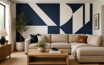
Geometric shapes bring a different kind of rhythm to a wall. While stripes demand verticality, angles invite the eye to travel. In Johannesburg studios, I have seen faceted diamond patterns that make a plain wall look sculpted. These wall paint patterns rely on precision above all.
A simple triangle border at chair-rail height adds structure without fuss. For a bolder move, paint a single oversized hexagon behind a sofa. The effect is immediate.
- Triangles for energetic accents
- Diamonds to elongate a room
- Hexagons for a modern, modular feel
Angles change with your perspective, which is what makes them alive! A room never looks the same twice.
Chevron and Herringbone Styles
Chevron and herringbone are often mistaken for each other, but the difference matters. A chevron has stripes that meet at a clean point, like a row of arrows. Herringbone breaks that line into staggered rectangles, creating a woven texture. Both bring movement to wall paint patterns, yet they feel distinct.
The chevron’s sharp V draws the eye upward, which works well in rooms with low ceilings. Herringbone reads more quietly, almost like fabric, and suits studies or dining rooms. In Cape Town homes, I have seen herringbone used in a single accent stripe behind a sideboard, and the effect is refined without shouting.
- Chevron suggests direction and energy.
- Herringbone offers texture and calm.
These classic wall paint patterns reward patience. Tape lines must be crisp, and the angle must stay consistent. Get that right, and the pattern carries the room.
Bold Color Blocking Ideas
Bold color blocking is a wall paint pattern that rewards decisive choices. A single band of deep terracotta across the lower third of a wall, capped by a line of soft ivory, changes how a room reads. In Cape Town’s older homes, I have watched this technique respect high ceilings and plaster details instead of covering them.
The method requires a steady hand and a level head. Mark your boundaries, tape with care, and paint in thin layers. The payoff is a surface that looks intentional, and honestly, that is rare enough to celebrate!
- Below chair rail height for a grounded, formal feel
- As a wide horizontal panel behind a sofa, drawing the eye across the room
- As a framed rectangle around a window, giving architecture a second look
The most successful wall paint patterns in this style avoid excess. Two or three colours, clearly separated, produce a calm confidence that busy schemes cannot match.
Modern Decorative Finishes
Ombre and Gradient Transitions
Ombre finishes now account for nearly a quarter of all decorative wall paint patterns requested by South African homeowners, according to major paint suppliers. The technique blends one hue into another across a single surface, creating depth without the hard edges found in geometric designs.
Gradient transitions demand patience, and the payoff is worth it! A sponge, a sprayer, or a dry brush each yields distinct results. I have found the most striking applications move from deeper tones at the base to lighter tones near the ceiling, echoing natural luminance.
Several factors shape the final outcome:
- The number of shades selected from one colour family
- The moisture level of the paint during blending
- The texture of the underlying wall surface
These gradient finishes work beautifully in bedrooms and reading nooks where soft transitions feel appropriate.
Stencil Patterns for Subtle Texture
Stencil patterns now appear in one out of every five wall paint patterns specified by Cape Town interior designers. A fine mesh stencil applied with a low nap roller transfers pigment in a way that leaves the substrate visible, producing a texture that reads as fabric rather than paint. The effect is restrained, almost architectural, and it suits hallways, study walls, and powder rooms where noise would overwhelm.
The range of motifs is broader than the floral clichés. Geometric lattice, African inspired beadwork, and eroded tribal marks all translate into subtle relief. The scale relative to the room, the repeat registration on uneven plaster, and the viscosity of the glaze all shape the final appearance. A thicker glaze holds the edge better. A thinner wash allows the stencil to fade into the background.
Small sections prevent overlapping seams. A light mist of water on the stencil back eliminates the need for adhesive residue. These finishes produce a quiet luxury.
Metallic and Pearlized Accents
In a Johannesburg loft I visited, a wall of burnished copper shifts the room’s mood as the sun moves. Metallic finishes have moved beyond the feature stripe. Modern decorative finishes rely on mica and fine metal powders suspended in clear glazes, applied in overlapping veils. The result is not flat colour. It reads as depth.
Pearlized accents behave differently. They catch light from oblique angles and return a soft shimmer with a faint iridescence. The effect works best on plaster sanded smooth, since every undulation becomes visible. For wall paint patterns, the interaction between metallic and pearlized layers creates a surface that changes through the day.
Common approaches:
- Pearlized wash over a matte metallic base
- Metallic glaze in recessed panels
- Copper powder blended with dark wax
Each layer needs a dry time before the next. The pigment density and hand pressure determine the final movement of the light.
Distressed and Weathered Looks
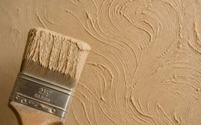
The most expensive wall paint patterns in Johannesburg mimic decay. Homeowners pay premium rates to achieve surfaces that landlords in other neighbourhoods spend money to hide. Distressed finishes borrow from the Italian tradition of marmorino and the Afrikaans farmhouse habit of whitewash, then add a layer of deliberate wear.
The application takes time. A base coat goes down, followed by a lighter or darker top layer, and then strategic sanding reveals the undercoat. Lime wash holds up well in Durban’s humidity. Chalk paint responds to a wet rag pulled vertically.
- Dry brushing over a tinted base
- Sanding edges and corners only
- Layering two complementary shades before rubbing back
When planning wall paint patterns with a distressed finish, restraint matters more than technique. Too much rubbing looks like a renovation accident. Too little produces a flat colour. Observe real wear patterns: door handles, skirting boards, and light switches show authentic ageing.
Sponging and Ragging Techniques
Flat colour has lost its appeal in Johannesburg. Homeowners want surfaces that change as sunlight moves across a room, and sponging delivers that depth with glaze and a natural sea sponge. The paint pools in irregular pockets, producing wall paint patterns that feel organic rather than manufactured.
Ragging works the opposite way. A crumpled cloth lifts wet glaze off the surface, exposing the base coat in soft, fibrous streaks. I have seen this technique used across Pretoria homes. It forgives an unsteady hand! A slight wobble becomes part of the texture.
Some painters prefer:
- Stippling with a dry brush to tighten the effect
- Ragging in diagonal passes to imitate natural light
- Layering two glazes for a deeper translucency
These wall paint patterns handle coastal moisture better than most wallpapers. That explains their presence in Sea Point apartments and Pretoria family homes.
Pattern Selection by Room Type
Living Room Focal Walls
Choosing the right wall paint patterns for a living room focal wall starts with how the light enters the space. Afternoon sun in South African homes can alter a pattern’s intensity, so I always observe the wall at different hours. A large-scale motif often holds its shape better than something fussy, especially when the wall sits opposite a window.
Consider these three factors before committing to a design:
- The wall’s width relative to your sofa, since a narrow wall needs a compact repeat.
- The existing artwork or rug colours, as the pattern should echo them without copying.
- The doorway sightlines, because a pattern gains strength when viewed from an angle.
These wall paint patterns work best when they anchor the room subtly. A focused selection turns the focal wall into a quiet frame for your furniture, not a competing element.
Bedroom Accent Wall Ideas
In a bedroom, the accent wall is the last thing you see before sleep and the first thing you meet at dawn. Morning light in a Cape Town bedroom is watery and kind, so wall paint patterns here should feel muted, almost whispered. I recommend a low-contrast repeat behind the headboard, something that blurs at the edges when the lamp is low.
Consider these guiding thoughts:
- The distance from bed to wall alters how the pattern reads. A tight repeat can feel busy from a pillow.
- The ceiling line matters more than expected. A pattern that stops abruptly can unsettle the room’s quiet.
- The paint sheen influences the effect. Matte softens the design, while a hint of satin catches the last evening glow.
The pattern stays close to the wall, quiet and unhurried.
Playroom and Nursery Patterns
A playroom rewards wall paint patterns that shift with the energy of the room. Bold, oversized polka dots or staggered arches create a sense of motion without overwhelming the eye. In a nursery, the same patterns appear in diluted form, softer contrasts and slower repeats.
Consider the viewing angle from the floor. A child lying on a rug sees the wall differently than a standing adult. For nurseries, keep patterns above the changing table subtle. For playrooms, let the pattern meet the floor with a lower border.
- Use two colours in the same family.
- Keep the repeat size larger than a hand span.
- Test the pattern under warm evening light.
DIY Application Tips and Tools
Tape and Masking Best Practices
Nothing ruins a carefully planned wall paint pattern faster than bleeding edges. The tape defines the boundary of your design. For curved lines, use flexible masking tape and press it down with a putty knife. For straight lines, check the alignment with a laser level before you commit.
Here is the order of operations I swear by:
- Wipe the wall with a damp cloth and let it dry completely.
- Apply the tape and burnish the edges with a credit card.
- Paint a thin coat of your base colour along the tape edge to seal it.
- Apply your pattern colour, then remove the tape while the paint is still wet.
Do not leave tape on overnight. The adhesive cures and lifts the paint below. In South Africa’s heat, tape can bond faster than paint dries, so work in smaller sections. The best wall paint patterns reward patience.
Choosing the Right Brushes and Rollers
The right applicator does more work than the paint itself. For wall paint patterns, the tool determines whether edges stay sharp and colour fields remain even. A 50mm angled sash brush cuts clean lines along tape, while a 230mm microfiber roller covers open areas without leaving lint behind.
Foam rollers suit metallic and pearlized finishes because they distribute pigment evenly. In South Africa’s heat, paint dries fast, so smaller sections and frequent reloading keep the finish consistent.
- Angled sash brush for tape edges and corners.
- Microfiber roller for flat, matte surfaces.
- Foam roller for smooth, glossy finishes.
Cheap brushes shed bristles into wall paint patterns. Washing new brushes with warm soapy water removes loose fibres. Match the roller nap to the wall texture; a 10mm nap suits smooth plaster, while an 18mm nap handles light stipple.
Sketching and Planning Your Layout
Before the first brush touches the wall, the pattern must exist on paper. Sketching your layout forces decisions about proportion, alignment, and negative space. A living room wall may look generous in person, but a scaled drawing will show whether a 600mm stripe feels bold or cramped. I plot patterns on graph paper, using one square for every 50mm of wall.
Then I transfer key marks using a chalk line and laser level. For asymmetrical designs, a photograph of the wall, printed and drawn over, works well. This is where wall paint patterns take their final form. South African plaster often carries a light stipple, so factor texture into the layout. What reads clearly on smooth gypsum may blur on a rough surface.
- Low winter sunlight washes out low contrast schemes
- Textured walls suit wider bands, as fine lines get lost
- Furniture placement can hide the most intricate section
Testing Patterns Before Committing
Before you commit a single liter of paint to a full wall, test your wall paint patterns on a removable board or a hidden corner. The texture of South African plaster will alter how lines read, and pigment absorption varies between brands. Paint a sample patch that includes two full repeats of the pattern. Then step back. If the pattern feels chaotic from the sofa, it will feel worse from the doorway.
Observe the sample across three lighting conditions: morning sun, midday shade, and artificial evening light. Low winter light flattens contrast, while dim bulbs can turn subtle gradients into murky zones. For DIY application, keep a roller with a 12mm nap for smooth areas and a thicker nap for textured walls. Apply thin coats. One heavy coat drags and leaves ridges.
- Photograph the sample in raw daylight and review it on a screen
- Trace the pattern edges with a pencil before painting
- Run a finger over the dry sample to check for bleed
Budget-Friendly Pattern Alternatives
The average South African garage holds enough half empty paint tins to redecorate a small flat. DIY application comes down to patience and the right tools. An angled brush saves hours of masking frustration. For the pattern itself, use a 12mm nap roller for flat plaster and a thicker nap for textured walls. Load the roller evenly. Wall paint patterns suffer when one edge dries before the next stripe begins.
- Use a kitchen sponge to dab on contrasting shades
- Cut your own stencil from a plastic folder
- Repurpose a credit card edge for crisp lines
These tricks keep wall paint patterns affordable without sacrificing the finished look. Paint stores often sell mistinted cans at half price, which work well for test patches. You do not need specialist equipment to achieve a striking result, only a steady hand and a willingness to work slowly.
Fixing Common Painting Mistakes
Most wall paint patterns fail in the first ten minutes, not the last. The paint goes on too thick, the roller skips, and suddenly the whole design looks like a compromise.
Fix it before it dries. Keep a damp cloth folded within reach and wipe away mistakes immediately. Once the paint sets, sand lightly with fine grit and reapply a thin coat. For bleeding edges under tape, run a craft knife along the seam while the paint is still tacky.
- Damp rags for instant correction
- Fine sandpaper for dried ridges
- A craft knife for clean seam lines
Wall paint patterns reward patience over speed. Correct small errors early and the finished surface will look deliberate.

0 Comments