
Creative Paint Techniques for Walls
Color Blocking
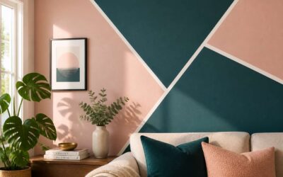
Color blocking turns a room from a passive backdrop into an active element of your home. It is the art of painting geometric panels, two or three shades that converse rather than clash. In Cape Town homes, this technique has migrated beyond nursery walls into living spaces where it makes a statement.
The approach demands restraint. Choose a wall that anchors the room, then divide it with painter’s tape at straight or angled lines. A deep forest green beside a soft blush. A warm terracotta against a cool grey. The result is wall paint with design that alters how you perceive the room’s proportions.
The charm lies in imperfection. Hand-painted edges and slight texture variations remind us a human made this. For those who tire quickly:
– Paint only the lower half of a wall for a wainscot effect
– Use one bold colour with a thin neutral stripe as a separator
– Frame a doorway with a contrasting hue
Choose your hues with intention. The wall paint with design you select will define the room’s character for years.
Ombre and Gradient Effects
Gradient walls are no longer a Pinterest experiment. In Johannesburg homes, they have become a practical way to soften harsh sunlight. The ombre technique blends two shades into one another, with no hard lines between them. Unlike color blocking, this approach uses only a gradual shift.
The wall paint with design here works best with muted tones. A dusty olive fading into cream, or a slate blue dissolving into pale grey. The effect adds depth without demanding attention.
- Vertical gradients lift low ceilings.
- Horizontal gradients stretch narrow rooms.
I have seen this done badly when painters use too much water. The result is a muddy stripe. Done well, it is the most forgiving finish in paint.
Textured Paint Finishes
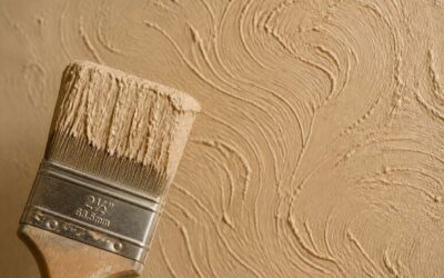
Johannesburg walls face dust, sun, and children. Texture hides all three. A sand finish catches the low afternoon light, while a trowel-applied skim coat softens the glare that bounces off flat white walls.
This wall paint with design approach uses tools you might not expect. I have used combs, sponges, and even old credit cards to create ridges and grooves. Each mark becomes part of the surface.
- Sand texture, which adds grip and warmth.
- Skip trowel, which leaves a subtle, random pattern.
- Venetian plaster, which creates depth through layered sweeps.
The texture is not permanent decoration. It is a functional layer that reduces echo and hides scuffs. For busy households, this matters!
Metallic and Glitter Accents
Metallic and glitter accents are not subtle. They reflect light in ways flat paint cannot. In a Highveld living room, a copper paint finish catches the late afternoon sun and casts it across the ceiling. I have used metallic rollers to create a brushed steel effect on a single accent wall. The result changes as you move past it.
Glitter paint works differently. It contains fine mica particles that flash in small bursts. For a Johannesburg family home, a glitter wash over a neutral base adds celebration without full sparkle. The effect is deliberate.
- Metallic glaze over a darker base, which adds depth
- Glitter topcoat in a single coat, which allows the base colour to show through
- Fine mica additive mixed into a clear sealer
This wall paint with design approach becomes a living element when light moves across these surfaces. The shimmer shifts with the position of the sun. It gives a room a sense of time passing.
Geometric and Patterned Wall Designs
Geometric Shapes
The most impactful design element in a room often costs nothing more than a tin of paint and a straight edge. Geometric shapes, when applied through wall paint with design, create depth without physical texture. In South African homes, bold triangles, diamonds, and hexagons are emerging as permanent architectural statements.
Precision matters more than artistry. I have learned that crisp lines depend on masking tape and a steady hand. The real skill lies in scale. Oversized polygons open up small rooms. Compact, repeating patterns add intimacy to sprawling spaces. Common approaches include:
- Chevron stripes that guide the eye horizontally
- Scattered diamonds for a fragmented, modern look
- Symmetrical hexagons for a honeycomb effect
For anyone exploring wall paint with design, each option changes how light behaves on the surface. Matte finishes absorb, while satin sheens bounce light across the angles. In South Africa’s bright climate, this interplay becomes a daily spectacle.
Stripes and Lines
Some say a stripe is just a stripe. Those people have clearly never seen a skirting board painted to match a ceiling. In the world of wall paint with design, lines are the quiet overachievers, doing heavy lifting without shouting about it. A single horizontal band can steady a chaotic room, while vertical lines are the optical illusion that grants ceiling height where none exists.
The true magic happens when you break the rules. Stripes need not be uniform, nor must they run the full height of the wall.
– Consider a single, bold stripe at wainscot height to anchor the space.
– Try a cluster of fine lines near a doorway to create a stylish frame for your passage.
– Use a thick, solid stripe behind a sofa to build a visual focal point that needs no artwork.
South African homes often grapple with awkward angles, and deliberate striping solves this elegantly. A room with low ceilings and a long wall benefits from a horizontal line painted at eye level. This draws the gaze outwards, making the space feel broader. When using wall paint with design in this manner, keep the palette grounded in the same family.
Do not underestimate the power of a pinstripe. In a study or home office, a series of fine lines in a matte finish offers a nod to classic tailoring. It is a detail that rewards those who look closely. The difference between a plain wall and one with carefully placed stripes is the difference between a simple sketch and a finished drawing. It is deliberate, and it is effective.
Working with lines demands a solid plan. Measure twice, tape once, and be honest about whether your walls are truly straight. Old South African houses have charm, but they rarely have perfectly true corners. Accepting this quirk means adapting your design to the wall, rather than forcing the wall to conform. The result remains refined, but it is a refinement that respects the building’s character.
Of course, there is always the devious option. A subtle, slanted line that gently curves at the top has the effect of a room that is quietly leaning towards the sun. This particular trick works wonders in a breakfast nook. It is playful without being juvenile, and it keeps the eye moving in a way that straight lines simply cannot. Just make sure the angle is intentional, because a wobbly stripe will never, ever be mistaken for art.
Chevron Patterns
Chevron patterns bring a rhythm that plain stripes cannot claim. The zigzag forces the eye to travel, measuring each peak and valley. In a Cape Town hallway, a chevron in muted ochre and grey can soften a long, narrow passage. The angle of the V matters. A steep angle creates sharper movement, while a shallow angle feels steadier.
Consider how wall paint with design transforms a bare surface into a structured statement. This deliberate use of wall paint with design requires a steady hand.
- Use a wide chevron for dramatic effect.
- Choose a narrow chevron for a tailored look.
- Align the central point with a window or doorway.
The pattern demands precision but rewards with a visual rhythm that is modern and enduring.
Polka Dots
Polka dots on walls are either a playful rebellion or a calculated act of whimsy. Some see them as a retro nod, others as a tool for awkward alcoves. When applied as wall paint with design, polka dots reward restraint. A single accent wall with dots in soft sage can lift a Cape Town bedroom without overwhelming it.
The size of the dot matters. Large circles feel sculptural. Small dots read as texture. Consider the spacing.
- Dots scattered randomly create a lively surface.
- Dots in a grid impose order and calm.
A matte finish keeps the look sophisticated. Glossy dots on a flat background add subtle depth. Use wall paint with design to control the visual weight. The result is a pattern that never demands attention, but carries a quiet confidence.
Mondrian Inspired Grids
Piet Mondrian saw the grid as a way to distill chaos into order. His late paintings use black lines and blocks of red, yellow, and blue, balanced by white space. When translated into wall paint with design, this approach turns a flat surface into a deliberate composition.
The key is restraint. A Mondrian inspired grid demands precise taping and a steady hand. The black lines should vary in weight. The coloured blocks should sit with purpose, never crowding the white areas.
In a small Johannesburg flat, I have seen this pattern define a dining nook. In a Cape Town cottage, it adds structure to a room with high ceilings. The wall paint with design becomes the focal point, and everything else steps back.
The defining elements:
- Blocks of primary colour held in check
- Black lines that vary in thickness
- White space that carries the composition
The result has steady presence.
Houndstooth
Houndstooth borrows from tailoring, but on a wall it transforms a room into a statement. This wall paint with design demands a steady hand and high quality tape. The result is a pattern that feels both classic and modern.
In Cape Town, I saw it in a narrow hallway, drawn in charcoal and off white. It made the space feel deliberate rather than busy.
For a subtle effect, consider these pairings:
- Charcoal and cream
- Forest green and pale grey
- Navy and blush
The scale matters. Larger blocks suit spacious walls; smaller ones work in compact rooms. Houndstooth gives a home a quiet confidence, like a well cut blazer.
Stenciling and Mural Art
DIY Stenciling Essentials
The stencil predates the written word, with 30,000 year old hand prints found in South African caves. That same principle, transferring a shape through a cutout, now anchors modern interior design. It offers a level of precision that freehand murals rarely achieve.
Approach your wall paint with design as a layered exercise. The base colour sets the atmosphere, while the stencil imposes rhythm and order. A light mist of adhesive spray holds the template in place, and a dry brush prevents paint from seeping under the edges. Work in small, patient circles.
The essential kit is compact:
- A reusable Mylar stencil
- Low-tack spray adhesive
- A stiff stipple brush
- Artist’s tape for curved obstacles
Once the stencil is mastered, scale your ambition. Project the image onto the wall, trace the outlines, and fill them in. Your wall paint with design becomes a personal mural, an original mark that no wallpaper can replicate.
Creating a Focal Point Mural
The wall above a sofa sits empty until you decide otherwise. A focal point mural changes the room’s character, and stenciling offers the discipline to make it precise. Mural art opens the freedom to extend beyond the template. The two methods work together.
Project your design onto the wall and trace the outline with a pencil. The wall paint with design builds through layers, starting with the background wash, then the mid tones, then the sharp details. I always test the paint’s thickness on the corner first. Step away often to judge the balance from across the room.
- Match the mural scale to the furniture below
- Limit the palette to three shades
- Use low-tack tape to protect trim
The finished mural becomes the room’s anchor.
Using Painter’s Tape for Sharp Lines
The precision of a stencil meets the freedom of a mural when painter’s tape enters the scene. Tape creates the clean edge that holds the composition in place. Apply it along the stencil’s border before rolling the base colour, then peel it away to reveal a crisp boundary. That thin strip defines the difference between a professional finish and a hesitant stroke.
For freehand mural sections, tape guides the long straight lines that anchor a drawing. Press it firmly and seal the edge with a clear topcoat. Use a low tack variety on plaster, since South African walls often carry a textured surface. This technique gives any wall paint with design a combination of repeating motifs and loose, expressive line work.
- Wait for the paint to dry before removing the tape.
- Pull the tape back at a 45 degree angle.
The finished lines carry a sharpness that stencils alone cannot offer, while the mural keeps its spontaneous character.
Incorporating Wall Decals
Stencils anchor a composition, but wall decals offer a reversible counterpoint. I have seen Cape Town interiors where a hand painted mural gains a secondary layer from vinyl cutouts, each element complementing the other. The wall paint with design becomes a balance of permanence and flexibility.
On textured South African plaster, decals adhere best to smooth patches. Combine them with stenciled shapes to create depth without masking tape’s strict geometry. For example, a stenciled bird silhouette followed by a decaled branch extends the artwork beyond the painted edge.
- Use matte decals to match flat paint finishes.
- Position decals before final varnish for cohesion.
This approach respects the mural’s spontaneity while introducing precise, manufactured details. The result feels curated, not chaotic. What a satisfying finish that is!
Choosing the Right Paint and Tools
Paint Sheens and Finishes
The difference between a striking feature wall and a disappointing one often comes down to two decisions made before the first coat: the applicator and the sheen. Selecting the correct tools matters as much as the wall paint with design itself. A high-quality synthetic brush holds its shape through multiple coats, while a 10mm microfibre roller delivers a smooth finish on plastered walls common in Johannesburg and Cape Town homes.
Paint sheens determine how light interacts with the surface. The right choice depends on the room and its traffic:
- Flat finishes hide imperfections but mark easily.
- Eggshell offers a slight lustre and withstands cleaning.
- Satin performs well in hallways and kitchens.
- High gloss amplifies every flaw, yet it produces dramatic effects on feature walls.
South African sunlight is harsh, so UV exposure affects colour stability differently across sheens. A durable wall paint with design holds its hue despite prolonged sun.
Essential Brushes and Rollers
The moment a roller touches plaster, the outcome is set. I have watched homeowners in Johannesburg inspect a wall paint with design under strong morning light, only to destroy the effect with a shedding sleeve. The tool matters as much as the pigment itself.
Synthetic brushes hold their shape through multiple coats. A 10mm microfibre roller lays paint evenly on plastered surfaces common in Cape Town homes. The essentials are few:
- Synthetic bristle brushes for clean edges along ceilings and corners.
- A 230mm microfibre roller for large wall expanses.
- A narrow 50mm roller for cutting in around windows and door frames.
South African sunlight is relentless. A rough nap leaves grooves that catch light and fade unevenly. The finest wall paint with design cannot compensate for a loose fibre trapped in the finish. Select your applicator before you open the tin.
Paint Types for Interior Walls
In the world of interior walls, the pigment is only half the story. The substrate underneath and the environment it endures dictate the correct choice. A single glance at the Durban humidity or the Highveld’s dry winters tells you that a universal paint does not exist. The right base coat ensures your wall paint with design actually performs as intended, resisting the wear of daily life.
Selecting the correct interior finish prevents costly rework. Think of the paint as a protective layer, not just a colour. The wrong sheen can highlight every imperfection or dull a carefully chosen hue. A wall paint with design demands a base that allows the pattern to shine.
Here is a quick breakdown for typical South African rooms:
1. Flat paint for ceilings and low-traffic areas.
2. Eggshell for general living spaces, balancing washability.
3. High gloss for trim and features you want to emphasize.
Ultimately, a reliable brand offered at your local hardware store provides the pigment load needed for true colour. Skimping on the base paint is a false economy. The design relies on a stable foundation to carry the visual weight.
Using Painter’s Tape
Most paint failures trace back to the tools, not the tin. A cheap brush leaves streaks, and low grade tape lifts the edge of your wall paint with design before it cures. South African hardware stores stock tapes for delicate surfaces and rough plaster. Match the tape to the paint’s sheen and the substrate’s porosity. Flat finishes hide tape marks. Gloss does not.
Water based paints allow early tape removal. Solvent based paints need patience. Pull too soon and the film stretches. Wait too long and the adhesive welds to the wall. Test on an offcut first.
Keep these points in mind:
- Press the tape edge with a putty knife.
- Buy separate rolls for smooth and textured walls.
- Store tape away from heat.
The right combination of paint and tape protects your wall paint with design from a second weekend of sanding.
Color Selection Tips
The sunlight in Cape Town is not the sunlight in Durban. I have watched a coastal wall change from ochre to umber in an hour! When you choose a shade for your wall paint with design, you are negotiating with that specific geography. The same can that looks serene in a Boland farmhouse might feel severe in a coastal flat.
Tools carry this responsibility as well. A short nap roller leaves a smooth membrane, while a longer nap leaves a subtle stipple that catches the light differently. The colour you see in the tin is a raw material; the applicator transforms it.
- The north wall honours cool pigments.
- The south wall holds deep hues without weight.
- The east wall reveals its secret at noon.
These are the quiet guidelines of our light. Between tool texture and wall orientation, your wall paint with design becomes a matter of patience.
Maintenance and Longevity of Designed Walls
Cleaning and Touch-Ups
Designed walls are investments. Their longevity depends on the routine you establish. A wall paint with design demands gentle handling. Use a microfiber cloth and pH-neutral cleaner. Avoid abrasive scrubs. For textured finishes, dust with a soft brush. Food stains need immediate attention. Let them set, they become permanent.
Touch-ups follow a clear sequence:
- Retrieve the same batch of paint.
- Test sheen on a hidden corner.
- Apply with a tiny roller.
- Blend outward.
Seal the can tightly. Write the date. This care preserves your crafted surfaces for years.
Repainting and Refreshing
Every wall paint with design has a finite brilliance. Sunlight and humidity are the arbiters, gradually affecting pigment and binder. The vibrancy of the space fades, or your taste evolves beyond the current scheme. Refreshing does not mean stripping back to bare plaster.
Deciding to repaint a designed surface starts with the original finish. A new coat in a complementary neutral can recede, allowing the existing pattern to dominate the space. You may choose to paint over sections. This suits geometric or stencilled work when a portion feels dated.
A few factors determine whether a wall paint with design can be refreshed directly. High gloss surfaces resist new paint poorly, so sanding becomes necessary. Multiple previous coats may create an uneven texture.
Preparation matters before any repaint. Wall residue affects adhesion. Light sanding creates tooth for the new layer, and a suitable primer resolves differences between old and new paint.

0 Comments